

Orange often has a bad rap, it can have connotations of cheap airline flights and popular kids' TV channels (you know exactly what we're referring to)... not the vibe most people want in their home, right? But use it wisely and orange really can bring style, joy and sophistication to any home interior.
Let us show you how.
Use orange to create energy.
Take our Electric Orange for example: it's fun, playful and bold and it's about as classic orange as you can get, therefore it would look great in nurseries, offices or as part of a creative mural due to boost mood and add cheer.
Using too much of this shade though may cause inadvertent feelings of irritation and stress so make sure to consider smaller proportions of this type of orange shade in the home. Pair with warmer whites to add balance and to really let that colour shine.
 Becca @beccaaaacollier and her Electric Orange-painted bathroom are an incredible example of the energy this paint colour could bring into your home. Clearly, it makes the perfect outfit backdrop too. Win-win!
Add warmth and comfort through the colour orange.
On the other hand, our Loving Orange is a cocooning, and immersive shade and wants to envelop you in a big warm hug. Its burnt, bronzy richness will immediately make you feel comforted and grounded and would look incredible drenched in a living room or bedroom.
Or how about a luxurious addition to kitchen cabinets as demonstrated here where this rich, burnt orange hue is paired beautifully with Serene Peach? Such a timeless and elegant approach to orange that you’ll continue to love for years to come. You know we love that sustainable life.

Our Loving Orange and Serene Peach paint colours create a harmonious and tonal colour palette that looks cohesive, calming and energising at the same time.
Soften the orange shades with pink colours.
Orange loves a tonal palette, that’s why we love pairing our Joyful Orange with harmonising pops of soft pinks to balance and intrigue. Joyful Orange actually has a healthy dollop of pink in it so is a great option for those who aren’t so sure about a straight up orange.
Again proportions are key here, use more of our bold, luminous Joyful Orange if you want to create a feeling of joy and energy, or use a softer pink as the main hue such to give a feeling of calm and peace. Calming Peach or Serene Peach would be perfect for this look.
Check out our favourite Joyful Orange colour combination to get inspired.
Alternatively, have a look at the combination of our Loving Orange and Loving Neutral paint colours instead. 'Grounded Simplicity', part of the four 2023 colour and furniture trend themes we've created together with Habitat, presents this soft and muted, yet bold colour combination that brings an earthy palette into your space and creates a strong connection with nature, the Biophilia movement and the feeling of being lost in a cosy cottage deep in the forest.
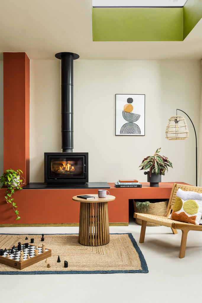 'Grounded Simplicity', a theme by YesColours and Habitat. Cabinets: YesColours Loving Orange paint; Walls: YesColours Loving Neutral paint; Ceiling: YesColours Passionate Olive Green paint. All furniture items are Habitat.
Create contrast for a real statement.
Orange is *way* more versatile than you think, trust us. Not only can you use it to create a tonal palette as mentioned above; you can use it to create bold colour statements too. Why not try pairing orange with a rich hue like the YesColours Passionate Blue paint colour? This will help to create a contrasting and exciting interiors scheme.
Little tip: it is often helpful to choose one as the more dominant colour to ensure the scheme doesn’t get too overwhelming, so consider prioritising either blue or orange in this type of scheme. Equally choosing a less saturated tone can have the same outcome, so perhaps consider our Serene Blue paint colour as a calmer alternative.
Add in accessories.
Not ready to embrace orange on your walls just yet? Don't worry, no need to force it. Why not try it in your accessories instead, such as cushions, throws and artwork? You could even use our sample pots to upcycle small items such as picture frames, lamps and old canvas - the possibilities really are endless.
Even adding in warm wooden furniture like rattan chairs, sideboards and cabinets can have that same warming influence on your interior scheme.
 Our Joyful Orange paint colour is way more versatile than you think, and can transform itself into a bright, positive orange or a saturated coral pink shade, depending on the sunlight, interior scheme and soft furnishings around.
Ultimately, think of orange as your comforting and optimistic best friend - dependable, multitalented and always surprising. Plus, it's one of the trendiest paint colours for 2023, so what's not to like? Go on, we dare you not to love it!
We hope these home decor tips have inspired you to introduce some orange paint colours in your home decor palette. And hey, if you still need some help, feel free to book a colour consultation with us and we’ll sort your colour puzzle in no time. Free option is available too!
Share your YesColours home transformation by tagging us on Instagram.