We developed a practical, team-ready colour manual to equip staff with the confidence and knowledge to communicate colour effectively. Combining technical colour science with storytelling, it enables teams to sell a feeling, a mood and a sense of wellbeing—not just a shade.
The guide includes colour insights exploring the history, psychology and cultural significance of each hue, alongside explanations of hue, saturation and lightness. Detailed colour profiles provide RGB and HEX codes, mood descriptors, visual merchandising guidance and recommended applications, while colour pairing guidance helps teams confidently create complementary and monochromatic schemes.

Mud Australia.
A Case Study.
How a colour training manual transformed the way teams communicate, sell, and present a porcelain collection.

Standardise colour communication across teams.
Mud Australia's 19-shade porcelain collection balances self-expression with function. The brand needed their sales and marketing teams to communicate colour with confidence—moving beyond simple naming to discussing mood, application, and the story behind each piece.
The challenge was straightforward: sales teams required a reference tool that would allow them to recommend colours strategically across retail, digital, and marketing channels.
A comprehensive colour training manual.


Helping teams communicate products and colour with confidence.
We developed a practical, team-ready manual designed to equip staff with the knowledge they need to communicate colour effectively.
The manual combines technical colour science with storytelling, enabling teams to sell a feeling, a mood, and a sense of wellbeing—not just a shade.
The manual structure:
- Colour Insights exploring the history, psychology, cultural significance, and narrative behind each shade.
- Colour Science breaking down the properties of hue, saturation, and lightness.
- Detailed Profiles for each colour with RGB/HEX codes, mood descriptors, visual merchandising guidance, and recommended applications.
- Colour Pairings guidance on complementary and monochromatic schemes.


The complete guide to colour application.
From individual shades to strategic colour collections.
Each colour entry in the manual transforms a single shade into a complete storytelling and merchandising tool. Every profile combines colour knowledge, brand narrative and practical guidance, including:
- Definition – An introduction to the colour, its characteristics and its role within the wider collection.
- Colour Pairings – Guidance on how the shade works alongside existing brand colours to create cohesive palettes.
- Mood – The emotional qualities and atmosphere the colour is designed to evoke.
- Visual Merchandising – Practical advice on using the colour within retail displays, product groupings and customer journeys.
- Tablescape Vibe – Styling inspiration to help customers visualise the colour in real-life settings.
- Best For – Recommended applications and customer use cases for each shade.
- Anecdote – The story, heritage and product narrative that gives each colour meaning.

The result: Consistent brand communication.
The manual enables three critical shifts across the organisation:
Informed Storytelling. Sales teams now understand the story behind each colour and can communicate it confidently to customers. Instead of describing a pot by shade name alone, they can talk about mood, provenance, and how it functions in a customer's home.
Consistent Brand Application. The manual provides a universal visual language across retail, digital, and marketing channels. Showroom displays, product photography, and campaign materials now follow consistent colour guidance and strategic pairing.
Stronger Customer Experience. Customers benefit from knowledgeable staff who can guide them toward colours that work for their spaces and their lives. Recommendations feel intentional rather than arbitrary.
What the Manual Delivers
- A team-ready resource that functions as:
- A sales training document enabling staff to speak authoritatively about colour.
- A reference guide for visual merchandising and display strategy.
- A source of brand storytelling for marketing and content creation.
- A practical guide to colour pairings and collection styling.
The manual transforms how a brand communicates about colour. For retail and lifestyle brands, it's the bridge between product and customer—equipping teams to move beyond describing what something looks like to helping customers understand how it will feel in their space.
Other projects.

CDW 2026.
The Way You Make Me Feel: A Collaboration Between Conran and Partners, GF Smith, and YesColours
See more
Decorex VIP.
In 2024, YesColours created an immersive VIP lounge experience at Decorex International.
See more
J. Adams & Co.
A collaboration between two British brands shaped by craft, longevity, and considered design.
See more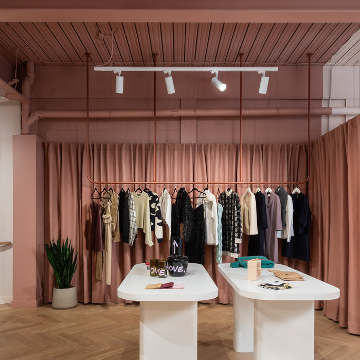


“True to our sustainable ethos, YesColours helped us create a space we love — and the colours get endless compliments.”
Platform Store
Stacy Chan

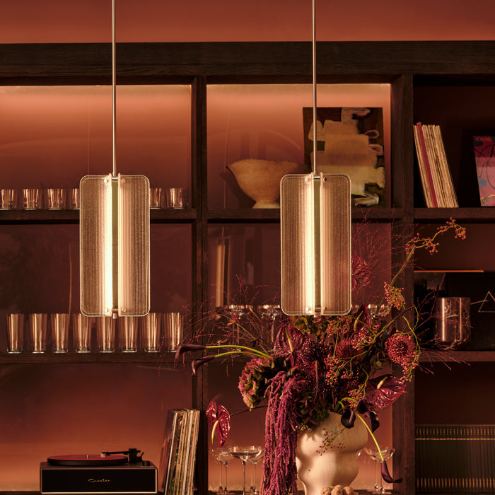


"This collection draws on the raw textures of our industrial heritage and translates them into shades that feel refined, timeless and purposeful".
J.Adams & Co.
Will Earl

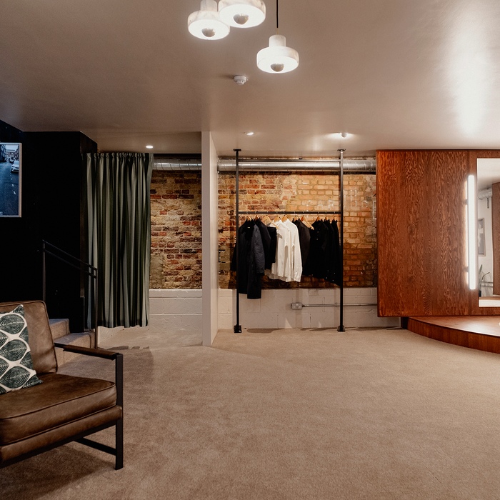


"People slow down, browse more thoughtfully, and connect more deeply with the garments, the exact behaviour we hoped for".
Batch LDN.
Sam Matanle, Co-Founder,.

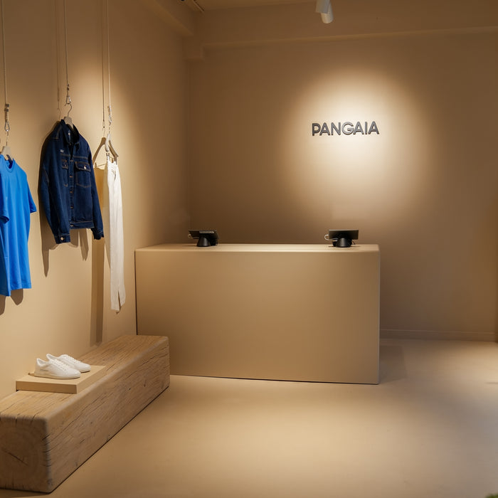


"This wasn't simply a commission, it was a partnership between brands who speak the same design language."
PANGAIA
Maria Srivastava


Get style tips.
Suscribe to our newsletter & get fresh ideas every week!
Got a question?
We're happy to help you.
Drop us a message and our team will come back to you.
